
Table of Contents
You open an email on your phone, scroll to the bottom, and see a mess: tiny fonts, broken links, and an off-center company logo. The beautiful email signature you created on your desktop now reads like a Picasso painting.
That’s what happens when you don’t design with mobile email signatures in mind.
Even though 60% of emails are opened on mobile devices, most email signatures are created for desktop layouts. Without a responsive or adaptable design, your signature won’t adjust to different screen sizes.
That’s why a mobile-friendly email signature is so critical. It’s designed to display cleanly across all email apps and devices, keeping your info clear and clickable on every platform.
In this blog, we’ll cover how to make mobile email signatures, how to test different formats, and tools to make them easy to scale.
How Poor Mobile Signatures Hurt Your Brand
When someone opens your email on a phone and sees a messy, hard-to-read signature, it chips away at your credibility. First impressions matter, especially in crowded inboxes. If your custom email signature breaks into multiple lines or has images that don’t load, it can make your message feel rushed or unprofessional.
This kind of friction adds up. Most email opens happen on mobile, so what you think looks polished on your desktop may leave clients, customers, or partners confused or unimpressed on a smaller screen. Forgetting how your signature renders across devices is an easy mistake, but it can quickly deter clicks without you even knowing. (Read How to Track Clicks and Impressions in Email Signature Marketing to learn more.)
It doesn’t take much to get it right. A simple layout with clear contact details, a clean link to your website or calendar, and a personal touch can go a long way. Just make sure you double-check the format before you hit Save Changes on your email settings.
Let’s take a closer look at how to make fantastic mobile signatures.
What Makes a Mobile-Friendly Email Signature?
A mobile-friendly email signature rethinks how users view, interact with, and tap through your information on smaller screens.
Simplicity and Readability First
Good email signature design starts with clarity. You’ll want to choose accessible font sizes. Typically, 12-14pt is best for readability. Be sure to stack info vertically using line breaks. Too much information in one line can quickly clutter a mobile email signature and make it hard to read.
Decorative logos can also become distorted on smaller screens, so it’s best to stick to the vital contact information.
Screen-Smart Layout
Mobile email signatures need to be responsive. It’s best to use a single-column format and stay within a 320px width to display consistently across most smartphones. Using a clean HTML structure (like inline CSS) gets better rendering across major email clients.
This makes your signature adaptive without using overly complicated code.
Core Elements That Work Well on Mobile
A mobile-friendly email signature should load quickly, look sharp on any screen, and highlight the needed info. Here are the essential elements that keep your email signature light but impactful.
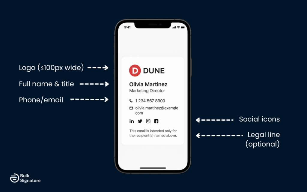
Logo and Contact Info
Keeping it simple gives the best mobile email signatures results.
- Use a company logo no wider than 100px.
- Stack your name, job title, and contact details vertically for better readability.
- Avoid wide layouts that cause line breaks or formatting issues across devices.
Social Media Links
Social media icons are quickly becoming a standard across email signatures. When formatted correctly, there’s no reason to ditch them just because you’re designing for mobile devices.
- Use small, clickable icons for platforms like LinkedIn, Instagram, or X.
- Add spacing between icons so it’s easy to click on each one.
- Insert links using basic HTML for consistent display across mobile email clients.
Tip: Only link to mobile-optimized profiles. If your LinkedIn page or Instagram feed doesn’t load well on phones, that disconnect can hurt the experience. It’s also important to have a strong profile picture for your social media accounts.
The goal is to drive engagement without sending someone to a clunky or misaligned page.
Minimal Images, Optimized Size
While visual elements tend to be the biggest culprits behind messy mobile email signatures, they’re still important branding pieces. When adding images, be sure to:
- Compress images to reduce load time on mobile devices.
- Avoid large graphics and animated GIFs, which often break on smartphones.
- Stick with one or two static visuals that support your brand.
Tip: Pre-built email signature templates give you a tested layout, support brand consistency, and simplify your setup across devices.
Add Alt Text for On-the-Go Accessibility
While not exactly a “core” element, alt-text is a great way to add for two reasons. One, it supports accessibility, and two, most people reading email on mobile devices are on the go. Some people might be scrolling on the treadmill or listening to emails while driving. Most mobile devices have built-in screen-readers, like VoiceOver (iOS) and TalkBack (Android), that read recipients’ emails out loud.
Adding descriptive alt text to your email signature images makes sure your message still gets through, whether it’s being seen, heard, or is having issues loading entirely.
Quick tips:
- Be specific but brief (e.g., “High school logo” or “Instagram icon”)
- Skip phrases like “image of” or “picture of.” Screen readers already note that
- Use it for all visuals, even decorative ones
Formatting Tips for Different Email Clients
When designing a mobile-friendly email signature, you need to consider how different email clients handle formatting. Gmail, Apple Mail, and Outlook all interpret HTML differently. While it can be a pain, if you build for compatibility and test across devices, you shouldn’t see another Picasso in your inbox.
Gmail and Gmail Mobile App
Gmail’s built-in signature editor plays well with clean HTML but tends to drop anything complex. Stick to inline styling and simple layouts to avoid rendering issues. Before launching your new email signature, always test it on the Gmail desktop and the mobile app for Android and iOS for a quick QA.
Best practices for Gmail:
- Use inline CSS only.
- Avoid copying from Word or other styled docs.
- Test both Android and iOS Gmail apps, which sometimes behave slightly differently.
Gmail is generally reliable, but it’s picky about formatting that’s not built directly within the client.
Looking for more Google resources? Check these out:
- How to Customize App Access on Google Admin Console
- What you Need to Know about Gmail Read Receipts: How to Know If Someone Read Your Email
- Why you shouldn’t overlook Google Workspace Marketplace in 2025
Apple Mail and iOS Devices
Apple Mail likes to keep you on your toes. It can scale down signatures unexpectedly if fonts are oversized or images are too big. Using moderate font sizes, small image files, and minimal decorative flair is usually your safest bet.
Best practices for Apple Mail:
- Use moderate font sizes (12–14pt).
- Keep images under 100 KB and test for auto-scaling.
- Preview on both iPhone and iPad to check spacing and load speed.
Because Apple optimizes heavily for mobile, even small misalignments can shift your layout unexpectedly. Always send yourself a quick test on an iPhone to double-check the signature’s responsiveness.
Accidentally sent an email in Apple before proofing? Learn how to unsend Apple emails with ease.
Microsoft Outlook and Office Apps
Outlook is the least predictable of the bunch. It often overrides your formatting and tends to misinterpret copied content, especially from Word or drag-and-drop builders. Inline CSS or table-based HTML tends to deliver the best results. The simpler the structure, the better the signature will display, especially on Outlook’s mobile app.
Best practices for Outlook:
- Build your signature using simple table-based HTML.
- Avoid background images and layered elements.
- Use inline styles exclusively and double-check on the Outlook mobile app.
If there’s ever a time to go minimal, it’s here. Outlook favors structure over style and will break things that are too fancy.
Want to learn more about Outlook? Read these:
Best Design Practices for Mobile Signatures
Here are some best practices that keep your mobile email signatures clean, readable, and on-brand, no matter what email platform they’re viewed on.
Use a Mobile-First Design Approach
Designing for mobile first makes everything easier. It forces you to focus on clarity, performance, and layout from the start. With more email opens happening on phones than desktops, this approach helps future-proof your signature.
And with Google prioritizing mobile-first indexing, it’s a smart way to align your email presence with broader digital trends.
Watch Your Spacing and Alignment
Clean spacing makes your signature easier to read and more trustworthy. Use clear line breaks between your name, job title, and contact info. Add consistent padding and margins to prevent crowding, and double-check how it renders on smaller screens.
A few simple spacing tweaks can completely change how polished your message feels.
Stick to a Single-Column Structure
Vertically stacking signature elements minimizes layout issues across mobile email signatures. The last thing you want is your job title, business logo, and contact information to overlap or misalign. This responsive stacking also makes it easier for email recipients to view messages on the go.
Keep Font Sizes Between 12–14pt
Small fonts are a common reason mobile email signatures fail the “squint test.” A minimum font size of 12pt keeps things easy to read on most devices. A 14pt usually works best on high-density screens like an iPhone.
Staying between this range strikes the right balance of saving space and staying readable.
Choose Colors That Prioritize Visibility
Mobile screens vary wildly in brightness and resolution. That means light gray text on a white background, or any combo with low contrast, can instantly make your signature unreadable. Stick to WCAG-recommended contrast ratios and avoid relying on color alone to communicate information. A well-contrasted layout helps your emails land clearly with every recipient.
Need help finding the best colors? Check out our guide on finding the right colors for your email signatures.
Minimize the Use of Images
Using too many images can slow down emails and throw mobile formatting out of whack. Stick to main images like a logo, and compress files to avoid lag on slower connections. Avoid using high-res graphics or animated GIFs. These are rarely supported by mobile email clients.
Tools and Templates That Help
Building a professional mobile email signature isn’t something most professionals want to do by hand. Fortunately, there are platforms that make it easier to deliver a on-brand, mobile-optimized email signature without digging into HTML. Here are two things to keep in mind when selecting a professional email signature tool:
Build with a Mobile-First Signature Generator
When picking an email signature platform, look for one that supports mobile preview and compatibility across major email apps. A responsive builder like BulkSignature lets you create custom mobile email signature layouts with drag-and-drop ease.
These types of signature generators also give users the ability to customize email signatures that are responsive across devices.
Use Microsoft Word with Caution
Microsoft Word can be useful for drafting a layout, but it’s not meant for email signature design. Copying directly from Word into a mail client introduces hidden formatting and code issues, like extra spacing, mismatched fonts, or strange background colors.
You can still use it as a starting point. Just convert your draft to clean HTML that can be added to your signature.
Tool Comparison
Here’s a quick comparison of tools that can help:
Tool | Best For | Pros | Considerations |
BulkSignature | Teams & organizations | Mobile-first layouts, drag-and-drop builder, auto-assignment by department | Ideal for company-wide rollouts, less focused on freelancers |
Wisestamp | Individual professionals | Social icon support, personal branding features | Limited control over layout responsiveness |
HubSpot Email Signature Generator | Quick setups | Free and easy to use, no login required | Fewer customization options, no backend management |
Pro tip: Choose a platform that offers mobile previews so you can see exactly how your signature appears on different devices and email clients.
How to Test a Mobile Email Signature
Before you roll out a new email signature across your team, give it a proper test drive. A few small hiccups, like broken links, awkward line breaks, or stretched-out logos, can leave a lasting (and not great) impression. This final check helps ensure your signature looks polished and works exactly how you intended.
Manual Testing Tips
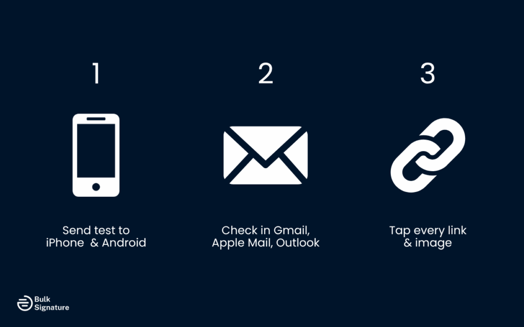
There’s no substitute for actually seeing how your signature performs in the wild:
- Send test emails to both iPhone and Android—check for layout shifts, font issues, and whether spacing holds up.
- Preview in Gmail, Apple Mail, and Outlook on both desktop and mobile to catch formatting quirks that vary by platform.
- Click every link—your website, social media, calendar, even your email address—to make sure they’re all working smoothly.
- Look at load time and layout for any images—especially logos or banners. Are they stacking properly? Are they crisp?
These small checks only take a few minutes, but they can prevent some pretty big problems later.
Automation Tools Speed Things Up
If you’re managing signatures at scale or just want extra peace of mind, testing platforms make the process smoother:
- Email on Acid and Litmus let you preview how your signature appears across different devices and clients in one place.
- BrowserStack helps simulate different mobile environments without needing 10 phones.
BulkSignature’s mobile preview tool lets you see layout changes live as you build.
Final QA Before Sending
Before rolling out your new mobile-friendly email signature across staff accounts, take a minute for a quick quality check. It’s the easiest way to avoid layout issues, broken links, or formatting quirks. Nothing makes a brand look unprofessional like a wonky email signature.
Use this checklist to make sure everything looks sharp and works how you planned:
Test Across iOS and Android Devices
Don’t assume your signature will behave the same on every smartphone. Open test emails on both iPhones and Android devices to check how your layout stacks, whether text aligns correctly, and how elements scale to smaller screens.
Preview in Multiple Email Clients
Gmail, Apple Mail, and Outlook all interpret HTML slightly differently. What looks great in one might break in another. Be sure to send test emails to each platform and review how your formatting holds up, especially spacing, line breaks, and images.
Confirm All Links Work
Clickable links are one of the most useful elements in a professional email signature. But they don’t help if they don’t work. Tap each link on mobile to ensure it leads to the right place and that the text or icon is easy to interact with on touchscreens.
Optimize Image Clarity and Load Speed
Even one blurry image or slow-loading logo can make your whole signature look unprofessional. Keep image file sizes small, use the right format (like PNG), and make sure your logo or photo looks crisp across devices.
Check for Readability and Clean Layout
Make sure your fonts stay within the recommended 12–14pt range and that everything stacks in a single-column layout. This keeps your signature scannable on the go and ensures your contact info doesn’t get lost in formatting issues.
Bring Your Signature Into the Mobile Era
You have absolutely no control over where your emails are opened or how an email client renders your signature. What you do have control over is how adaptable and responsive your email is. Creating a mobile-friendly email signature is the new standard for professionalism, consistency, and brand trust.
You can create impactful and visually appealing mobile signatures by optimizing layout, reducing image weight, and choosing elements that scale well across screen sizes. No matter what email platform you or your recipients use, designing with mobile devices in mind creates a communication experience that encourages users to respond faster and engage more confidently.
Looking to streamline the process? Start with mobile-optimized templates or try a platform like BulkSignature to create, assign, and scale professional email signatures across your entire company. Your brand will look sharp, no matter where it’s viewed.
Chat with one of our email signature experts to see how we can help.
Frequently Asked Questions for Mobile-Friendly Email Signature Design
Why does my email signature look weird on mobile?
Mobile email apps typically render HTML and images differently from desktop clients. If your signature isn’t mobile-optimized, elements can shift, resize incorrectly, or appear misaligned. That’s why you should always optimize for mobile-friendly email signatures and test them across different email platforms.
Why does my email signature look fuzzy?
Blurry logos or icons are usually caused by low-resolution images. Try using images at 2x the display size (e.g., 200x100px for a 100x50px space) and save them in PNG format for sharper display.
PNG files are supported across different email clients, including Gmail, Microsoft Outlook, and Apple Mail.
Why does my signature change fonts on Outlook mobile?
Outlook mobile doesn’t support all web fonts and may override your styling with default system fonts. Stick to safe fonts like Arial, Calibri, or Times New Roman to make sure your email signature looks professional on every platform.